Thank you for purchasing the Minimal Contact Form! This document will guide you through the installation and usage of this simple, elegant, accessible, and performant contact form.
contactform-TF/
└── documentation/
├── index.html
├── flat.html
├── minimal.html
├── modern.html
├── retro.html
├── sophisticated.html
└── preview/
├── To install the Minimal Contact Form, simply include the contact-form-minimal.html, contact-form-minimal.css, and contact-form-minimal.js files in your HTML project.
Here's a visual representation of the required files:

Copy the HTML code from contact-form-minimal.html into the desired location in your website's HTML structure. Make sure to link the contact-form-minimal.css file in the <head> section and include the contact-form-minimal.js file before the closing <body> tag.
<head>
<link rel="stylesheet" href="path/to/minimal-contact-form.css">
</head>
<body>
<!-- Your content -->
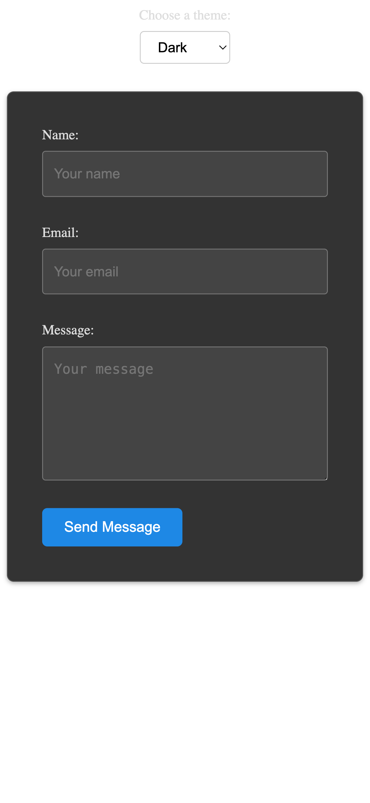
<form class="contact-form" action="#" method="POST" novalidate>
<div class="form-group>
<label for="name">Name:</label>
<input type="text" id="name" name="name" required aria-required="true" placeholder="Your name">
</div>
<div class="form-group>
<label for="email">Email:</label>
<input type="email" id="email" name="email" required aria-required="true" placeholder="Your email">
</div>
<div class="form-group>
<label for="message">Message:</label>
<textarea id="message" name="message" rows="5" required aria-required="true" placeholder="Your message"></textarea>
</div>
<button type="submit">Send Message</button>
</form>
<script src="path/to/minimal-contact-form.js"></script>
</body>
You can easily customize the appearance of the form by modifying the CSS rules in the minimal-contact-form.css file. The CSS is well-structured with comments to help you identify different sections and elements.
To change the colors of the form elements, modify the following CSS properties in minimal-contact-form.css. Here are some examples:
color property of the label rule.
label {
    color: #444; /* Default color */
    /* To change the color to a darker shade: */
    /* color: #222; */
}
border-color property in the rules for input[type="text"], input[type="email"], and textarea.
input[type="text"],
input[type="email"],
textarea {
    border: 1px solid #ccc; /* Default gray border */
    /* For a light blue border: */
    /* border-color: #add8e6; */
}
background-color property of the rule for button[type="submit"].
button[type="submit"] {
    background-color: #007bff; /* Default blue */
    /* For a green button: */
    /* background-color: #28a745; */
}
color property in the rule for button[type="submit"]. The default is white.
button[type="submit"] {
    color: white; /* Default white */
    /* For black text (if the background is light): */
    /* color: #000; */
}
border-color and box-shadow in the rules for input:focus and textarea:focus.
input[type="text"]:focus,
input[type="email"]:focus,
textarea:focus {
    border-color: #007bff; /* Default blue focus */
    box-shadow: 0 0 0 0.2rem rgba(0, 123, 255, 0.25); /* Subtle blue focus shadow */
    /* For a green focus: */
    /* border-color: #28a745; */
    /* box-shadow: 0 0 0 0.2rem rgba(40, 167, 69, 0.25); */
}
To adjust the font used in the form, modify the font-family property in the CSS rules for label, input, textarea, and button. You can also integrate Google Fonts by adding the <link> tag in the <head> of your HTML file and then referencing the font family in your CSS.
<head>
    <link rel="preconnect" href="https://fonts.googleapis.com">
    <link rel="preconnect" href="https://fonts.gstatic.com" crossorigin>
    <link href="https://fonts.googleapis.com/css2?family=Roboto:wght@400;700&display=swap" rel="stylesheet">
</head>
body { /* Or a more specific selector */
    font-family: 'Roboto', sans-serif;
}
You can adjust the size and spacing of the form elements by modifying properties like width, padding, and margin in the CSS rules for the respective elements (.contact-form, .form-group, input, textarea, button). For example, to make the form wider:
.contact-form {
    max-width: 600px; /* Default is 400px */
}
Similarly, you can adjust the padding inside the input fields:
input[type="text"],
input[type="email"],
textarea {
    padding: 1rem; /* Default is 0.8rem */
}
The current Minimal Contact Form includes the "Name", "Email", and "Message" fields as required. If you were to add optional fields (like "Subject" or "Phone" from other styles), you can control their visibility using the .d-none utility class provided in the common.css file. To hide an optional field, add the .d-none class to the .form-group of that field in your HTML:
<div class="form-group d-none">
    <label for="subject">Subject:</label>
    <input type="text" id="subject" name="subject" placeholder="Subject">
</div>
Make sure to link the common.css file in the <head> section of your HTML file, alongside the minimal-contact-form.css file:
<head>
    <link rel="stylesheet" href="path/to/minimal-contact-form.css">
    <link rel="stylesheet" href="path/to/common.css">
</head>
To show the field again, simply remove the .d-none class from the .form-group.
The text for the labels (e.g., "Name:", "Email:", "Message:") and the submit button ("Send Message") can be directly changed within the contact-form-minimal.html file by editing the text content of the <label> and <button> elements.
Important: This contact form provides the front-end structure and client-side validation only. To handle the form submission (sending emails, storing data), you will need to integrate a backend solution using a server-side language (like PHP, Node.js, Python) or a third-party service (like Formspree, Netlify Forms).
To translate the form labels and any potential JavaScript error messages, you will need to modify the text content directly in the minimal-contact-form.html file for the labels and in the minimal-contact-form.js file for the error messages.
This contact form is designed with accessibility in mind:
<label> elements associated with their respective inputs using the for attribute.aria-required="true" for required fields.The form is lightweight and optimized for performance with minimal CSS and JavaScript.
For any questions or issues, please refer to the ThemeForest support section for this item.
Thank you again for your purchase!