Thank you for purchasing the Modern Contact Form! This document will guide you through the installation and usage of this stylish and functional contact form.
contactform-TF/
└── documentation/
├── index.html
├── flat.html
├── minimal.html
├── modern.html
├── retro.html
├── sophisticated.html
└── preview/
├── To install the Modern Contact Form, simply include the contact-form-modern.html, contact-form-modern.css, and contact-form-modern.js files in your HTML project.
Here's a visual representation of the required files:
Copy the HTML code from contact-form-modern.html into the desired location in your website's HTML structure. Make sure to link the contact-form-modern.css file in the <head> section and include the contact-form-modern.js file before the closing <body> tag.
<head>
    <link rel="stylesheet" href="path/to/contact-form-modern.css">
</head>
<body>
    <!-- Your content -->
    <form class="contact-form modern" action="#" method="POST" novalidate>
        <div class="form-group">
            <label for="name-modern">Name:</label>
            <input type="text" id="name-modern" name="name" required aria-required="true" placeholder="Your name">
            <span class="validation-icon success"><svg ...></svg></span>
            <span class="validation-icon error"><svg ...></svg></span>
        </div>
        <div class="form-group">
            <label for="email-modern">Email:</label>
            <input type="email" id="email-modern" name="email" required aria-required="true" placeholder="Your email">
            <span class="validation-icon success"><svg ...></svg></span>
            <span class="validation-icon error"><svg ...></svg></span>
        </div>
        <div class="form-group">
            <label for="message-modern">Message:</label>
            <textarea id="message-modern" name="message" rows="5" required aria-required="true" placeholder="Your message"></textarea>
            <span class="validation-icon success"><svg ...></svg></span>
            <span class="validation-icon error"><svg ...></svg></span>
        </div>
        <button type="submit">Send Message</button>
    </form>

    <script src="path/to/contact-form-modern.js"></script>
</body>
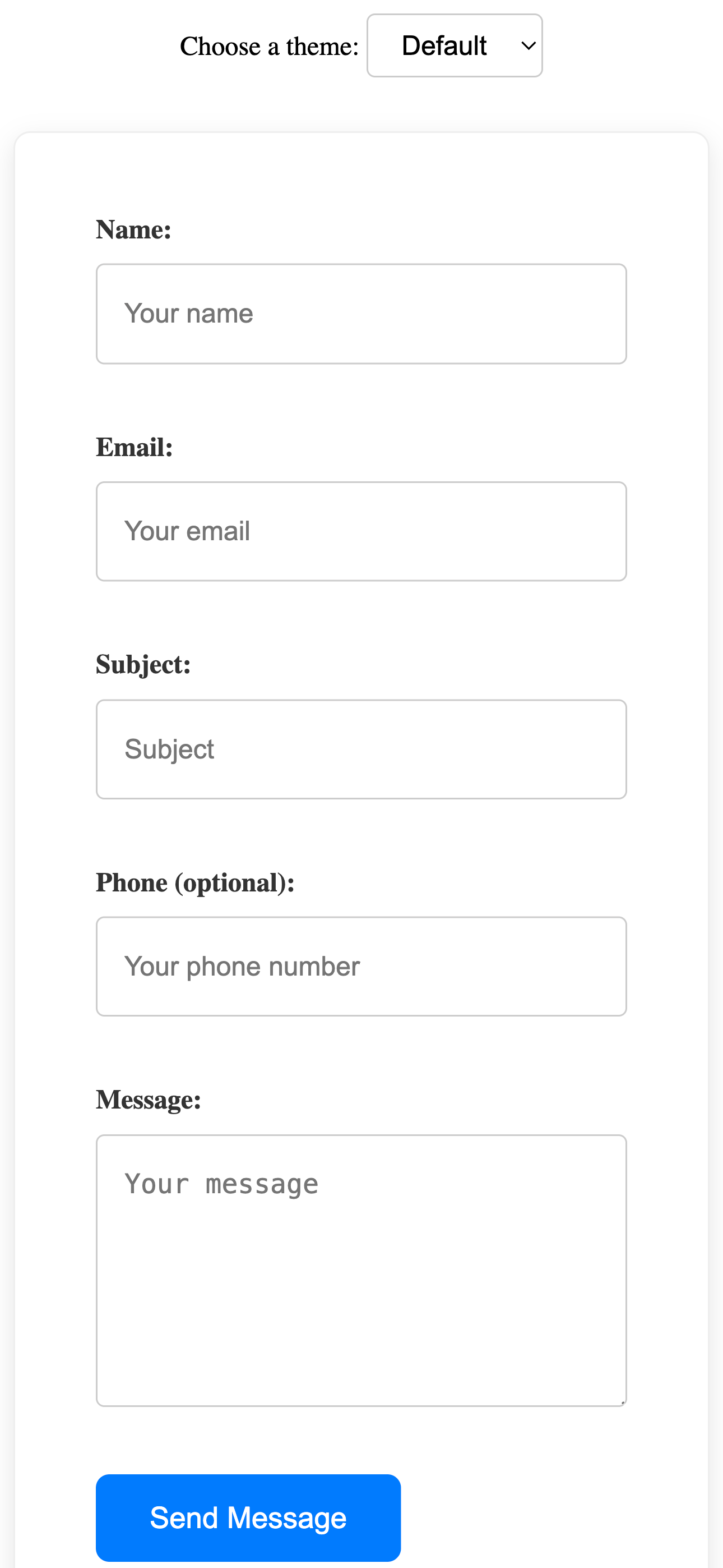
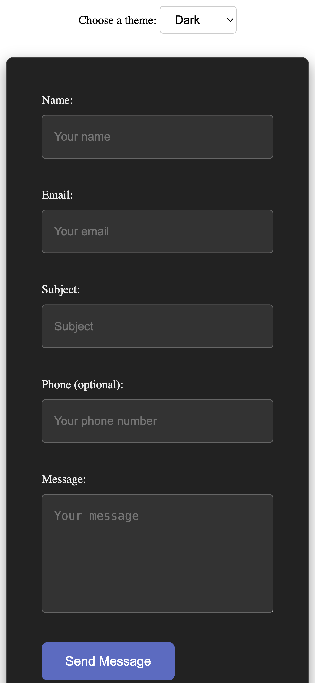
The Modern Contact Form offers a clean and stylish design that can be easily adapted to your brand. You can customize its appearance by modifying the CSS rules in the contact-form-modern.css file. Here's how to adjust some key visual aspects:
Modify the following CSS properties to change the color scheme of the form:
background-color property of the .contact-form.modern class.
.contact-form.modern {
    background-color: #fff; /* Default white */
    /* For a light gray background: */
    /* background-color: #f8f8f8; */
}
color property of the .contact-form.modern label rule.
.contact-form.modern label {
    color: #333; /* Default dark gray */
    /* For a primary brand color: */
    /* color: #007bff; */
}
border-color property in the rules for .contact-form.modern input[type="text"], .contact-form.modern input[type="email"], .contact-form.modern input[type="tel"], and .contact-form.modern textarea.
.contact-form.modern input[type="text"],
.contact-form.modern input[type="email"],
.contact-form.modern input[type="tel"],
.contact-form.modern textarea {
    border: 1px solid #ccc; /* Default light gray */
    /* For a more prominent border: */
    /* border-color: #999; */
}
background-color property of the .contact-form.modern button[type="submit"] rule.
.contact-form.modern button[type="submit"] {
    background-color: #007bff; /* Default blue */
    /* For an accent color: */
    /* background-color: #ffc107; */
}
color property in the .contact-form.modern button[type="submit"] rule. The default is white.
.contact-form.modern button[type="submit"] {
    color: white; /* Default white */
    /* For dark text on a light button: */
    /* color: #333; */
}
border-color and box-shadow in the rules for .contact-form.modern input:focus and .contact-form.modern textarea:focus.
.contact-form.modern input:focus,
.contact-form.modern textarea:focus {
    border-color: #007bff; /* Default blue focus */
    box-shadow: 0 0 5px rgba(0, 123, 255, 0.5); /* Blue focus shadow */
    /* For a different focus style: */
    /* border-color: #ffc107; */
    /* box-shadow: 0 0 5px rgba(255, 193, 7, 0.5); */
}
background-color in the .contact-form.modern button[type="submit"]:hover rule.
.contact-form.modern button[type="submit"]:hover {
    background-color: #0056b3; /* Default darker blue */
    /* For a darker accent color: */
    /* background-color: #e0a800; */
}
color property of the .contact-form.modern .validation-icon.success (default: green) and .contact-form.modern .validation-icon.error (default: red) rules.
.contact-form.modern .validation-icon.success {
    color: green; /* Default green */
    /* For a different success color: */
    /* color: #28a745; */
}

.contact-form.modern .validation-icon.error {
    color: red; /* Default red */
    /* For a different error color: */
    /* color: #dc3545; */
}
border-color of the .contact-form.modern input.is-invalid and .contact-form.modern textarea.is-invalid rules.
.contact-form.modern input.is-invalid,
.contact-form.modern textarea.is-invalid {
    border-color: #dc3545; /* Default red */
    /* For a different error indication color: */
    /* border-color: #ff0000; */
}
color property of the .contact-form.modern .error-message rule.
.contact-form.modern .error-message {
    color: #dc3545; /* Default red */
    /* For a warning color: */
    /* color: #ffc107; */
}
To change the font used in the form, modify the font-family property in the CSS rules for .contact-form.modern label, .contact-form.modern input, .contact-form.modern textarea, and .contact-form.modern button. Refer to the "Typography" section in the Minimal style documentation for instructions on integrating Google Fonts.
Adjust the size and spacing of the form elements by modifying properties like max-width, padding, and margin in the CSS rules for the respective elements (.contact-form.modern, .contact-form.modern .form-group, .contact-form.modern input, .contact-form.modern textarea, .contact-form.modern button). The principles are similar to those described in the Minimal style documentation.
Similar to the Minimal style, you can use the .d-none utility class from common.css to hide optional fields by adding it to the .form-group of the field in your HTML. Make sure common.css is linked in the <head> of your HTML file.
The text for the labels and the submit button can be directly changed within the contact-form-modern.html file by editing the text content of the <label> and <button> elements.
Important: This contact form provides the front-end structure and client-side validation only. To handle the form submission (sending emails, storing data), you will need to integrate a backend solution using a server-side language (like PHP, Node.js, Python) or a third-party service (like Formspree, Netlify Forms).
You would typically create a PHP script to handle the form submission when the user clicks "Send Message". The action attribute of the <form> tag would point to this PHP script.
<form class="contact-form modern" action="process_form.php" method="POST" novalidate>
    <!-- ... form fields ... -->
    <button type="submit">Send Message</button>
</form>
Your process_form.php file would then handle the data submitted via the $_POST superglobal, perform server-side validation, and send the email.
Formspree is a service that allows you to receive emails from your HTML forms without writing any backend code.
action attribute of your HTML form with this URL.
<form class="contact-form modern" action="https://formspree.io/f/your_form_endpoint" method="POST" novalidate>
    <!-- ... form fields ... -->
    <button type="submit">Send Message</button>
</form>
Formspree can also handle basic spam protection and email notifications.
Remember that client-side validation (provided by the JavaScript) is for user convenience. You must implement server-side validation to protect your website from malicious input and ensure data integrity.
To translate the form labels and any potential JavaScript error messages, you will need to modify the text content directly in the contact-form-modern.html file for the labels and in the contact-form-modern.js file for the error messages.
This contact form is designed with accessibility in mind:
<label> elements associated with their respective inputs using the for attribute.aria-required="true" for required fields.The form is lightweight and optimized for performance with minimal CSS and JavaScript.
For any questions or issues, please refer to the ThemeForest support section for this item.
Thank you again for your purchase!